Designing a Short Story Cover: Design, Technique and Legal Aspects
A good short story cover primarily needs three things: a clear central motif, distinctive typography and clarified usage rights. The publication format, whether app, e-book or print, determines the technical specifications and thumbnail suitability. Those who are sloppy with image rights risk costly cease-and-desist letters, because licensing issues are more complicated than many authors think.
In short:
- For an effective short story cover, a clear motif, distinctive typography and clarified usage rights are indispensable.
- High-quality covers can be created in JPEG, PNG or PDF formats, with 300 dpi considered standard for print and web heights typically between 1,600 and 2,560 pixels.
- When using images, written usage rights must be secured—especially for stock photos and illustrations—and a model release is necessary for identifiable persons.
- Typographically, the title should be short, high-contrast and easily readable, and an original title may also be eligible for copyright protection.
- Current cover trends favor reduced, color-rich designs or evocative illustrations, adapted to genre and platform.
Table of Contents
- Design basics: imagery, color and composition
- Technique: file formats, resolution and aspect ratio
- Image rights and licenses: mandatory checks before upload
- Typography and title design: short, concise, protectable
- Examples and inspiration: three case studies with lessons
- Workflow: six steps from concept to finished cover
- Trends in short story cover design and their impact
- Self-published vs. publisher covers compared
- Targeted design: reader appeal and genre expectations
- Psychological effects of colors and images
- Tips for choosing cover design software
- OutaStory as an option for publishing with your own cover
- FAQ
- Sources
Design basics: imagery, color and composition
A cover can work in three ways: with a photo, with an illustration, or purely typographic. Photos have immediate impact and are well suited to crime, thriller or realistic settings. Illustrations create narrative space and suit fantasy or children's genres. Purely typographic covers rely on type and surface and often appear reduced, elegant, sometimes also literary.
The choice of color climate shapes the mood more than any motif: warm tones signal closeness, cool tones signal distance or tension. Contrast ensures that title and motif remain readable on small screens, and negative space gives the eye a resting point to settle on.
For thumbnail suitability, a simple checklist applies:
- The title must still be readable at 120 pixels wide.
- A single large focal point attracts the eye; many small details blur.
- Fine lines and small type sizes are lost when reduced.
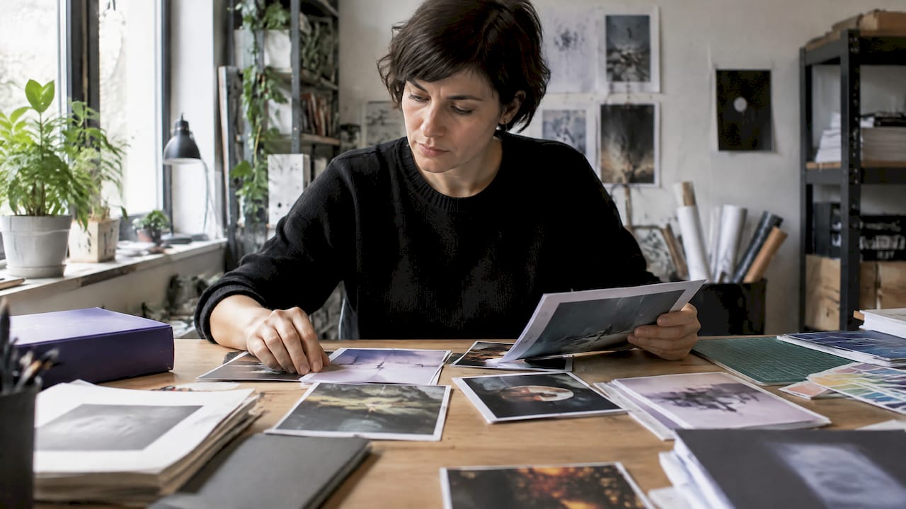
Pro tip: A moodboard with three to five reference images keeps style decisions consistent and saves later rounds of coordination with designers or photographers.
Technique: file formats, resolution and aspect ratio
Most short story covers follow an aspect ratio of about 1.6:1, referencing classic book cover proportions. For print products, a resolution of 300 dpi is standard, while web and app thumbnails work with pixel dimensions, typically between 1,600 and 2,560 pixels in height.
The color space determines later reproduction: sRGB for screens, CMYK for offset printing. If a cover is only shown online, export as JPEG or PNG; for print, PDF with embedded fonts is recommended.
Before uploading, a short check routine is worthwhile:
- Check bleed so that no text is cut off during printing.
- Observe the safe area, i.e., place important elements with distance from the edge.
- Check file size, because many platforms limit uploads to a few megabytes.
Image rights and licenses: mandatory checks before upload
Copyright arises automatically in Germany with the personal intellectual creation; registration is not required, as the DPMA explains in its copyright brochure. This applies to the short story text as well as to a cover image someone has created specifically for it. Whoever wrote the book therefore does not automatically also own the rights to the cover image: purchased images, commissioned illustrations or stock photos require a separate, written transfer of usage rights.
With image libraries one broadly distinguishes between royalty-free and rights-managed licenses. Royalty-free usually allows broader, time-unlimited use for a flat fee; rights-managed limits print run, period or medium more precisely. Even free image libraries have different conditions, and commercial use cannot be assumed automatically.
If persons are recognizable in the image, the image license alone is not enough: a model release is additionally required, i.e., a written consent for commercial use. Without this consent, cease-and-desist letters and injunction claims may occur, even if the image license itself was in order.
Practical to-dos before every upload:
- Save the license text and purchase receipt permanently, not just the download link.
- Record the scope of use in writing: medium, edition, period, territory.
- When in doubt, ask a lawyer, a publisher or the image agency directly—better one extra check than none.
Typography and title design: short, concise, protectable
Every letter counts for short story titles, because space is tight and readability in small preview images often determines the first click. A bold weight, sufficient contrast to the background, and a clear hierarchy between title, subtitle and author name make the difference.
Of interest to authors: brevity does not automatically exclude copyright protection, but it does not exclude it either. The European Court of Justice has ruled that very short texts can also be protected if they show an individual linguistic expression. An original, unusually phrased title can therefore be protected in individual cases, whereas a purely descriptive one rather not.
The hierarchy on the cover follows a simple order:
- Title first, largest font size, highest contrast.
- Subtitle or series note next, clearly smaller.
- Author name last, often placed at the bottom edge.
Avoid excessive drop shadows and glow effects, more than two typefaces on a cover, and letter spacing that is too tight or too loose, which makes reading difficult.
Examples and inspiration: three case studies with lessons
A minimally typographic cover, for example a dark background with the title in a striking serif, works especially well for literary short stories or anthologies. It signals seriousness but needs a really good type choice, otherwise it quickly feels empty.
A photo-centered cover lives from the image choice: a face with a clear angle of view or a landscape with depth draws the eye automatically to the title if the crop is right. Here the negative space in the upper third often decides where the text will later sit.
An illustrative cover opens narrative space, for example for fantasy or the children's area, because a drawn scene can convey more atmosphere than a photo. The lessons for all three variants:
- Typographically it only works with a really good, non-generic typeface.
- Photos need a free area for the title, otherwise it becomes cluttered.
- Illustrations should match the genre; a playful style feels inappropriate for horror.
Workflow: six steps from concept to finished cover
The path from the first idea to the finished cover can be divided into six clear steps:
- Create a moodboard and clarify the goal: which genre, which readership, which channel?
- Start image research or commission an illustrator, and clarify the license issue immediately, not only at the end.
- Create initial layouts, test fonts and check thumbnail effectiveness early.
- Finalize legal protection: document license, model release and scope of use in writing.
- Export for target platforms and add metadata like title, genre and description.
- Upload, verify display and adjust if necessary, for example if the title appears cut off in the app preview.
If you want to hand your design decisions to professionals, our overview of the cover designer offers insight into how collaboration with designers and the transfer of usage rights can work in practice.
Pro tip: Test the cover already in step 3 as a tiny thumbnail on a smartphone, not only at the final large format.
Trends in short story cover design and their impact
Current design trends for short story covers move between two poles: reduced typographic covers with bold color fields and elaborate, almost cinematic illustrations with strong lighting. Both directions work because they must stand out against the visual mass in app previews and streaming catalogs.
In genre fiction, such as romantasy or thrillers, muted, almost earthy color palettes are currently prevailing, often combined with a single symbolic figure or object instead of a whole scene. This feels more mysterious and invites clicks without revealing the story in advance.
In the children's area, clarity dominates: bold primary colors, friendly characters, little text. Here immediate recognizability matters more than implication, since young children or reading parents often make selections within seconds.
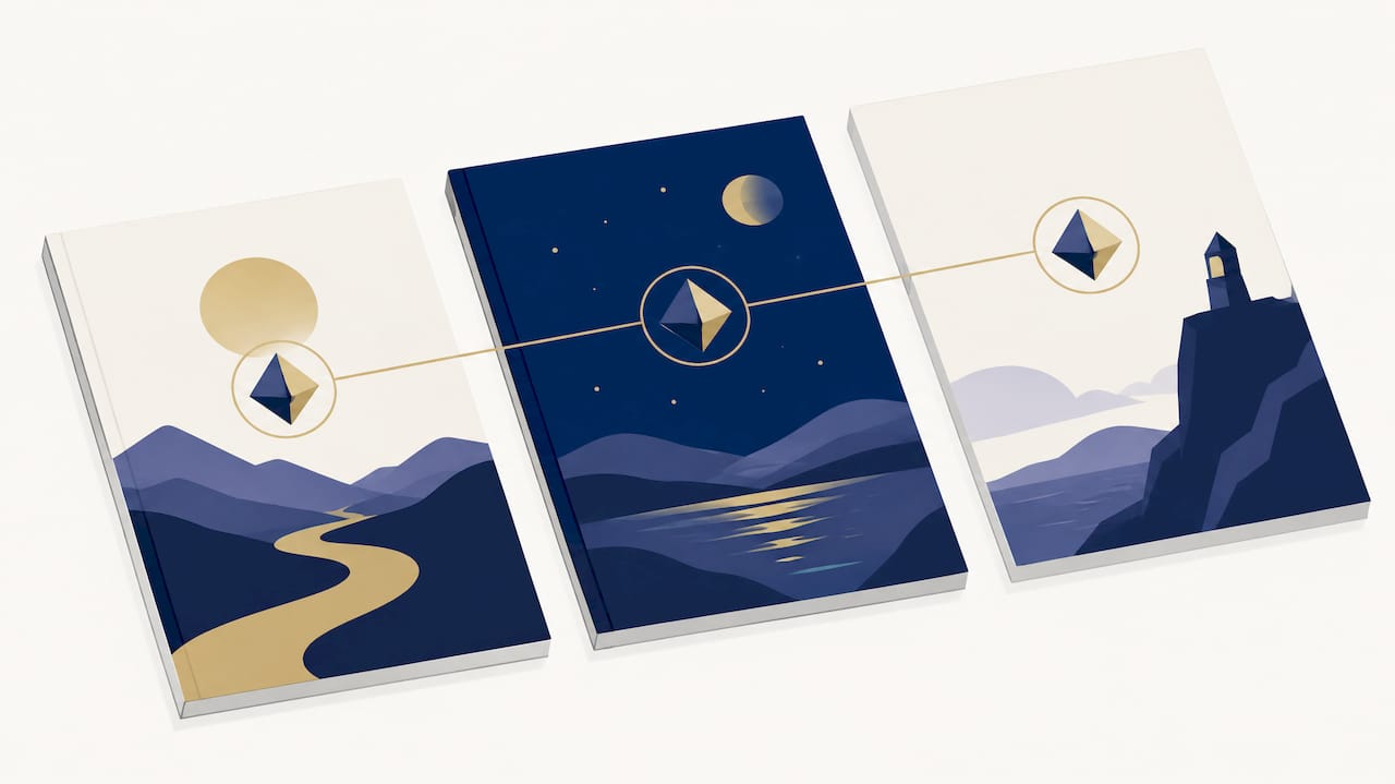
A trend that works across platforms is series identity: publishing a short story as a serialized, chapter-by-chapter release benefits from a recurring visual element, such as a color family or symbol that runs across all chapters. This creates recognition without every cover having to look identical.
Self-published vs. publisher covers compared
Publisher covers are usually created by a team: editorial, marketing and a commissioned designer coordinate over several drafts before a version is approved. This brings consistency across a series, but it takes time and is outside the author's control.
In self-publishing, the entire decision rests with one person, which speeds up the process considerably. Someone self-publishing a short story can go from draft to finished file in hours, but must also keep all licensing and quality issues in view that an editorial or legal department would otherwise check at a publisher.
The biggest difference for short stories compared to a full novel: the cover often has to hold up as a tiny thumbnail in an app list next to dozens of other titles, not as a large showcase cover in a bookstore. This shifts priority away from detail richness toward immediate readability and a single clear focal point.
Targeted design: reader appeal and genre expectations
A cover addresses a specific readership long before the first sentence is read. Genre conventions help: crime readers expect muted colors and a certain darkness, fantasy readers often expect hints of magic like lighting effects or fantastic beings, and a children's bedtime-story cover should aim for warmth and friendliness rather than tension.
When expectations are broken, for example a flashy colorful cover for a dark thriller short story, confusion arises instead of curiosity. That costs clicks, because the target audience does not recognize the cover as “made for me.”
At the same time, a deliberate contrast in the right place can pay off: a cover that stands out slightly within the genre, for example through an unusual color combination while keeping symbolic cues, is more likely to be noticed than one that disappears in the sea of sameness. The art is to meet genre expectations while remaining individual.
Psychological effects of colors and images
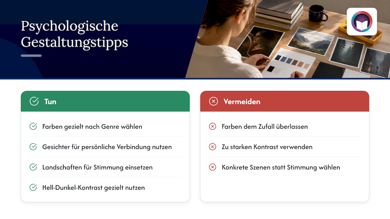
Colors trigger almost automatic associations before the mind reads the title. Red feels alarming and suits suspense or danger, blue feels calming or melancholic, yellow and orange signal warmth and accessibility. This effect can be used deliberately for the genre instead of leaving it to chance.
The image choice itself also works psychologically: a face with direct eye contact immediately creates a personal connection, while a landscape without figures rather offers space for the reader's imagination. For short stories, which are often mood-driven rather than plot-driven, a mood-setting landscape can be more fitting than a concrete scene.
High-contrast light-dark design additionally creates drama and depth, which hints at tension on the cover for thriller or horror short stories. Too much contrast can, however, appear restless; therefore always view the cover reduced before deciding on the final version.
Tips for choosing cover design software
For getting started, free tools with pre-made templates are often sufficient; they let you combine text, image and color quickly without needing graphic design training. If you need more control over layers, color correction and cutouts, turn to classic image editing software with professional features.
When choosing, consider primarily what the program will be used for later: pure image retouching, such as cutting out or color-adjusting a stock photo, requires different tools than layout work with text and composition. If you regularly produce covers and want to edit photos, you'll find an overview of permanently licensed photo-editing programs instead of subscription models at Vollversionen von Fotobearbeitungssoftware.
Regardless of the chosen tool: templates save time but do not replace thoughtful image selection. A program with a hundred functions is of little use if the central motif and typography do not fit together.
OutaStory as an option for publishing with your own cover
Once you've finished the short story and designed the cover, the next step is a platform where both come together. A short story can often be published quickly with its own cover, optionally serialized chapter by chapter, and optionally released as an audiobook with professionally produced voices or your own voice.
For authors this means concretely:
- Fast upload without a lengthy approval process; the cover stays completely under your control.
- Optional narration of the story if you want to reach listeners as well as readers.
- Participation in the earnings from your own stories through revenue sharing, where we retain a platform fee of 8 %.
Those who want to learn more about monetization can find an overview in our article on earning from short stories. If you prefer extended features for reading or listening, such as unlimited and ad-free access, take a look at OutaStory Premium.
FAQ
What are the four characteristics of a short story?
A short story is typically characterized by brevity, a limited cast of characters, a narrow timeframe, and a pointed, often open ending. These features also affect the cover, which should suggest the condensation of the story in a single image rather than narrate an entire plot.
What ideas are there for a book cover?
Proven approaches are a single symbolic object, a face with clear eye contact, a mood-setting landscape, or a purely typographic design with bold lettering. Which idea fits depends on the genre and whether the cover should convey suggestion or immediate recognizability.
Which short stories are currently popular?
Currently particularly in demand are stories from fantasy, romantasy, science fiction, crime, thriller, and horror, complemented by a growing children's segment with bedtime stories and animal adventures. These genres can be read for free or listened to as audiobooks on short-story platforms.
What is a cover for a book?
A cover is the visual exterior of a story, usually consisting of an image or illustration, the title, and the author's name, which together announce the genre and mood. It serves as the first impression and must work both in large format and as a small thumbnail.
Do I always need a license for a short story cover?
Yes, as soon as a third-party image or illustration is used, a clarified transfer of usage rights is required, even with free image libraries. This check is only unnecessary for entirely self-created images or purely typographic designs.
Sources
- Copyright: Your text, your image, your music – DPMA
- Copyright for authors: What belongs to me – and what may I use? - Autoren Guide
- Image rights at image agencies — Edition Blaes
Recommendations
Read and write on OutaStory
Thousands of short stories to read for free — or publish your own and find an audience.